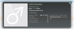
Member card stats and last activity in two columns
This idea has been shamelessly stolen from digitalpoint, as per the thread here: http://xenforo.com/community/threads/member-card-redesigned.47751/
Simply paste the following code into EXTRA.css to change the existing member card design to have two columns with the stats on the left and the last activity on the right.
Which results in this:

Note that if you have a lot of add-ons installed which hook into the member card stats, the content may break out of the bottom of the member card.
Edit: Add this if you also want the timestamp to be on a new line:
This is based on an unedited default style.
Other changes may be required for custom styles.
I wish you success.
This idea has been shamelessly stolen from digitalpoint, as per the thread here: http://xenforo.com/community/threads/member-card-redesigned.47751/
Simply paste the following code into EXTRA.css to change the existing member card design to have two columns with the stats on the left and the last activity on the right.
Which results in this:

Note that if you have a lot of add-ons installed which hook into the member card stats, the content may break out of the bottom of the member card.
Edit: Add this if you also want the timestamp to be on a new line:
Kod:
.xenOverlay.memberCard .lastActivity.pairsInline dd abbr {
display: block;
}
This is based on an unedited default style.
Other changes may be required for custom styles.
I wish you success.
